CookUp!

Mapping the Timesheet of Urban Cycling
Dataviz, Interactive, D3.js, Storytelling
Award : Kantar Information is Beautiful Awards 2017 — Longlist
This visualization explores the time-based patterns and relevant benefits in terms of cycling. We hope to encourage people to take up cycling and to promote both individual health and the sustainability of the urban environment. The dataset comes from Mar 2016 - Feb 2017 in Greater Boston, provided by Hubway Open Data.
Team member: Liuhuaying Yang

The overall data visualization is a time-based mapping, arranged in 365 days and 24 hours per day. For each day and each hour, hundreds of people contributed to the riding time. Besides the riding data, we also like to introduce the benefits of urban cycling. Yes, the dataset is not small, but we tried our best to visualize them on a single page.
The Timescale and The Legend


We made a trick here, by putting a gentle
legend at the bottom of the page, we want to let the users guess first: what do these dots stand for?
Go Deep To the Micro Interaction


We made each date as a straight line, putting them together, aligned them to the center, make them as a series of a heartbeat.
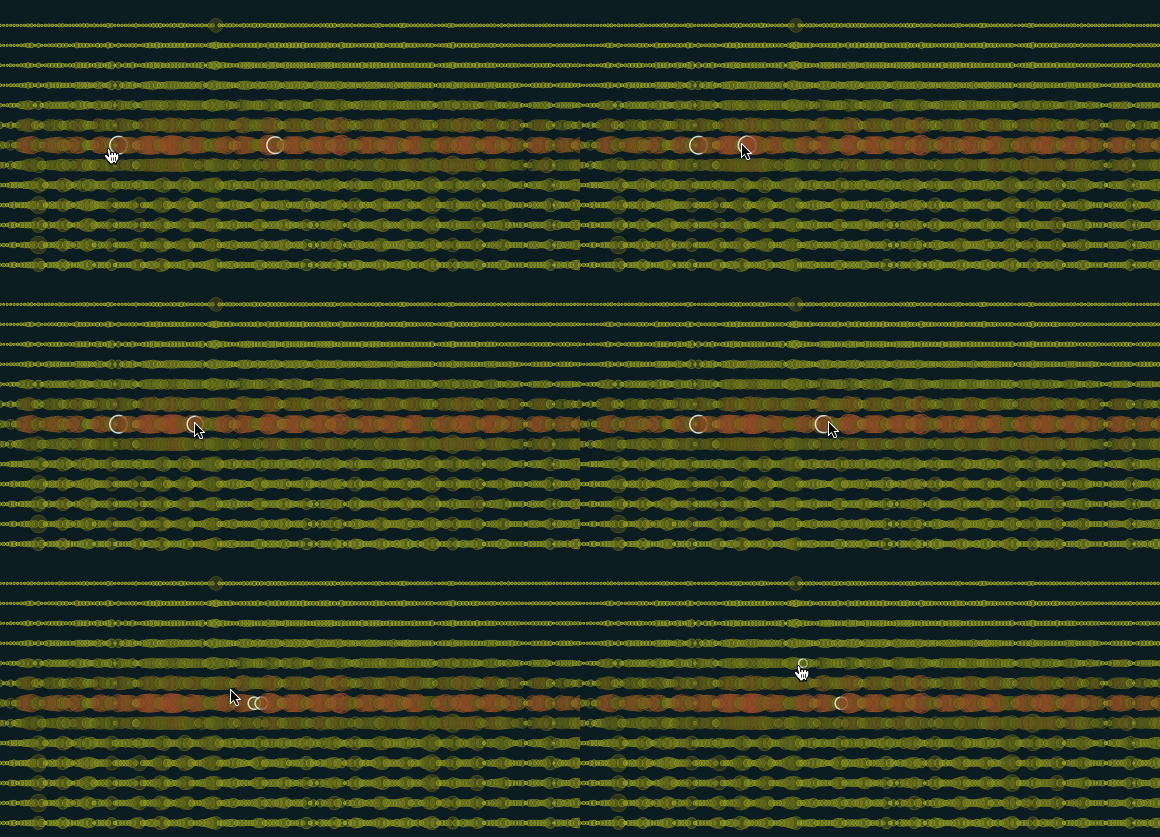
We let the arrow turn to hand to indicate it is a clickable line.
Users can mark the previous line they just checked, and compare the data change.


We made each hour as a dot, the bigger the size means more riding time that hour, the redder the circle means more riders contributed during that hour. The center of the circle is the junction of one day and one hour.
To put 365 * 24, 8760 dots together on a single page, we have to layer them on each other. We give transparency on the dots and set a bold outline to them. But how can the users find out which hour they are looking at? The solution is highlighting the outline and show the specific time on the top. Also, we left the previously clicked circle highlighted as users can make a comparison.


The biggest challenge. To go deep to explore on the dataset, we start to think about the visualization if a user wants to see how many people ride for how much time in a specific hour during a day.
The solution is to expand a new table/chart along with a line, the line is an extension of the date/ line clicked by the user.
To indicate there is a second hierarchy hidden, we made the mouse turn to be a hand on hovering on a line/date to encourage a action of click.
Limited by the screen space, we made the new chart expanding to two directions.
Design Process
Exploration on the data:
The data is from Mar 2016 - Feb 2017 in Greater Boston, provided by Hubway Data System which is a bicycle sharing system in the Boston, Massachusetts metro area. Every user's riding data is recorded under the categories like start time, start station, stop time, etc. Normally, visualizations on transportation data always show as geographic information Map. But for this project, we explored how data could be arranged by time, and then adding more information on the timesheet. So we only choose the data related to time.

Exploration on the time pattern:
There are different data patterns by the hour, weekday or season. By the hour, we could see the peak time over a day. By weekday, we could see that fewer rides with longer average duration on weekends while weekday on the contrary. By season, we can see the most rides in summer and the least in winter, and the average duration of winter is always shorter.


Exploration on the final layout:
The dot represents the rides, and the size of it represents the total of rides and the color represents the season. The x-axis is day and the y-axis is the hour. Then, we added more details for each day.


Synthesis:
After color trials, we replaced the color by season with by average duration. We tried different color scales for the fill color and stroke style, and also the background color.

Users' feedbacks:
At first, we wanted to make the timesheet look like a racing map, but the outcome is more than we expected... everyone told us it is a Weather Forecast for Boston!
I found data visualization is so magical as it can explore possibilities and reveal insights we never think about. But it also reminds me of thinking about readability for users. Although data visualization is populated nowadays, the public still needs more education on reading the "scientific" diagrams.
As a data visualization designer & visual designer, we should always put users' minds first, understand the form from the users' perspective, test our design with new users, understand their understanding. A fancy appeal is attractive, but usability is always the first.